UI DESIGN, TABLET
Lume Pad Design System
Building a Scalable Design System for a 3D Tablet
My Role
Research, UX/UI Design, Interaction Design, Wireframing, Prototyping
Timeline
March - June, 2022
Introduction
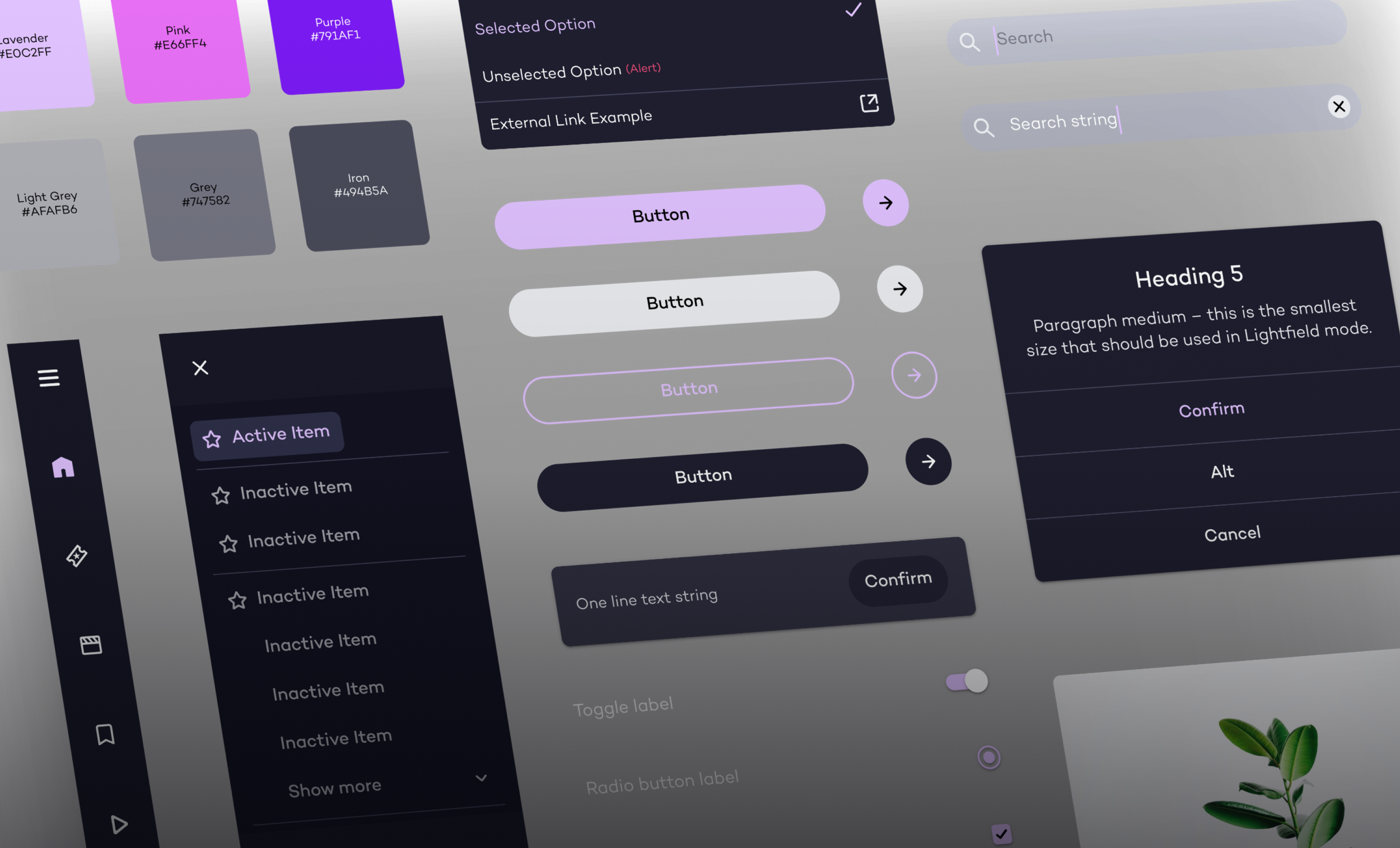
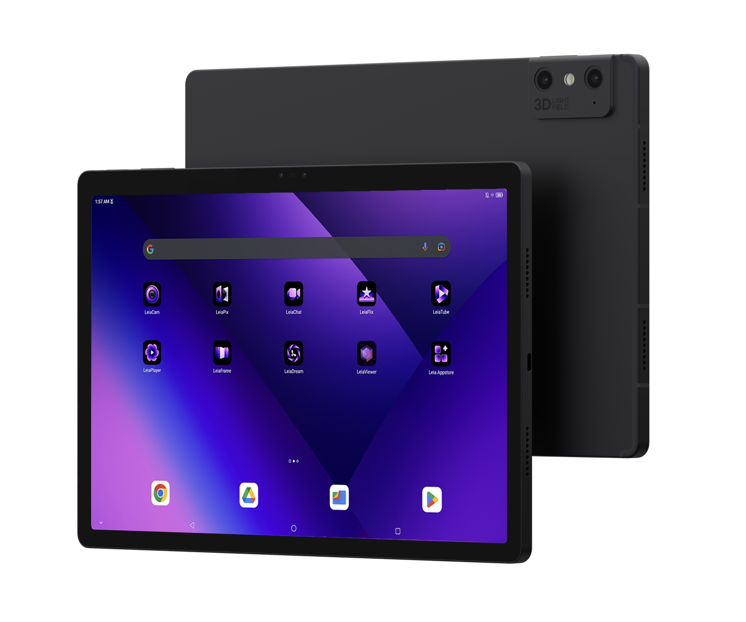
Leia Inc, a growing tech company, is known for its innovative 3D display technology. In 2023, it launched the Lume Pad 2, a tablet that provides stunning 3D visuals without the need for specialized glasses. Before the launch, I was tasked to create a design system that would standardize its visual language and enhance overall product consistency.
The Challenge
As Leia Inc expanded its product line and developed various built-in apps to showcase the capabilities of the Lume Pad, maintaining visual and functional coherence became a challenge. Inconsistencies in the user experience had the potential to confuse and frustrate users and undermine the brand identity.
Lume Pad Built-In Apps
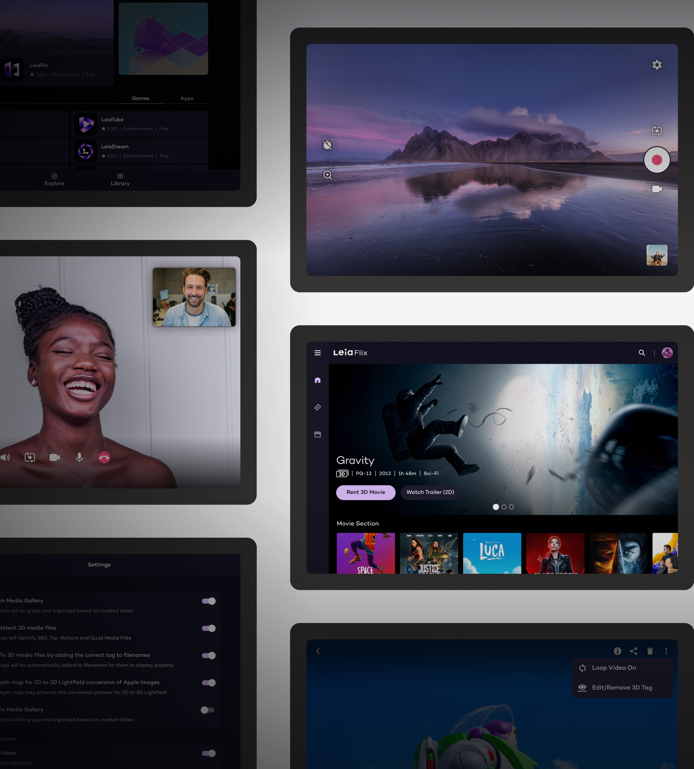
Streaming
Gaming
3D Photo and Video
3D Chat
Appstore
3D Model Viewing
The Need for a New Design System
To gain a clearer understanding of our current design ecosystem, I began by conducting a UI inventory of our main interface components.
The existing component library, originally developed for the first-generation Lume Pad, did not adapt well to new innovations and no longer met the evolving requirements of the Lume Pad 2's features. The introduction of new apps led to inconsistent user experiences, as varying design styles confused users and prolonged development cycles.
Research and Analysis
The process began with collecting insights from interviews with stakeholders—designers, engineers, product managers, and marketing managers. This helped identify design challenges and understand effective design system principles.
“
The design assets are so different, there were so many variants of buttons, text fields, and other components!
— Product Designer
“
Reusing components from other projects is difficult because they have different structures.
— Front End Engineer
“
Our products have many inconsistencies in colors and fonts, which has a negative impact on the overall user experience and the brand image!
— Marketing Manager
Component Inventory
I conducted an inventory and categorization of all existing design assets in the current design files, legacy websites, and tablet apps.
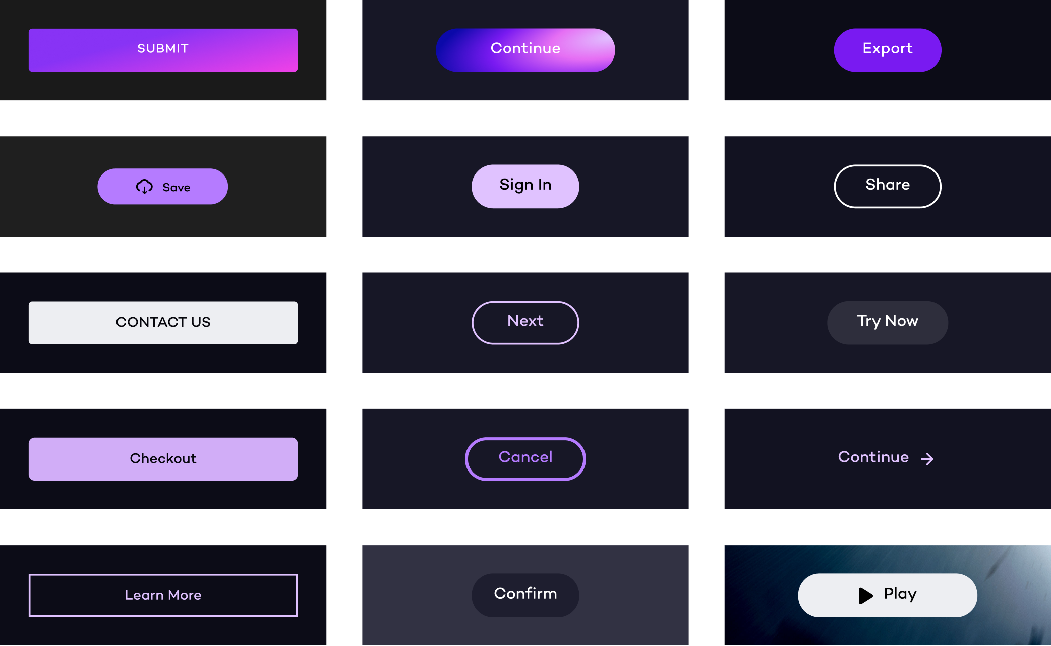
For example, I found inconsistencies in button design:
Padding and color shades: Multiple padding sizes and various shades of purple were used for buttons.
Stroke and rounding styles: Different stroke colors, weights, and corner rounding were applied to buttons.
Goals
With these challenges in mind, the new design system needed to address these goals:
Establish consistent visual elements to improve the user experience across all Leia products.
Accelerate the design and dev process with a ready-made component library and centralized design guidelines.
Enhance brand perception and user engagement with a consistent design language.
Promote accessibility by inclusion in the component libraries from both design and code aspects.
Benchmarking
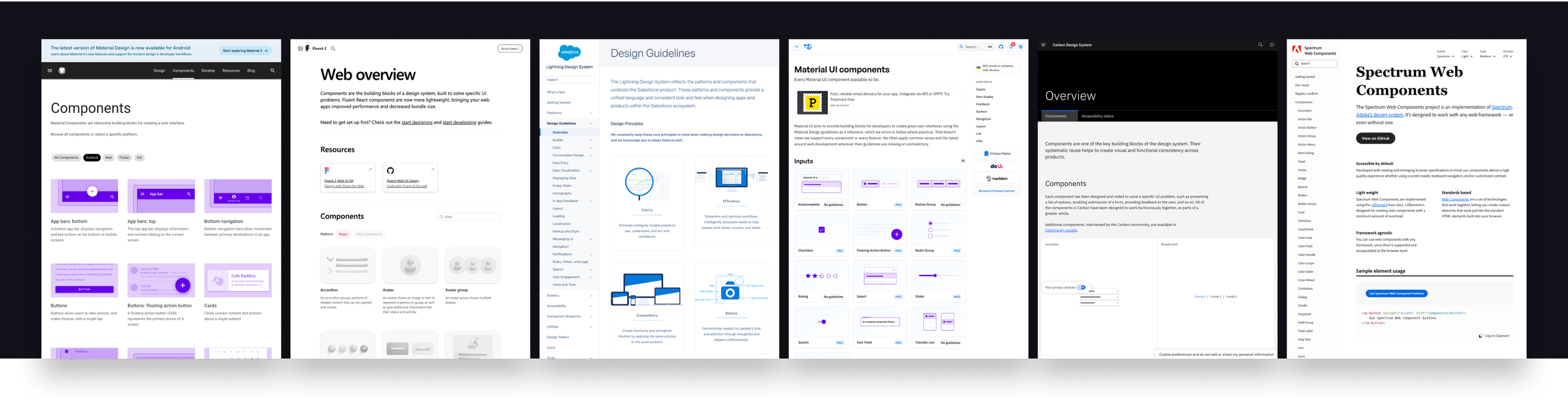
I conducted research on 6 established design systems to identify common themes, trends, and best practices within the industry. Since the Lume Pad OS is based on Android 12, Google's Material Design system was chosen as the primary reference for our new design system.
Building the Design System
Starting with the foundational elements (atoms) of the design system, such as colors, typography, and buttons, I then move on to more complex blocks and pieces (molecules, organisms, and pages).
1. Style
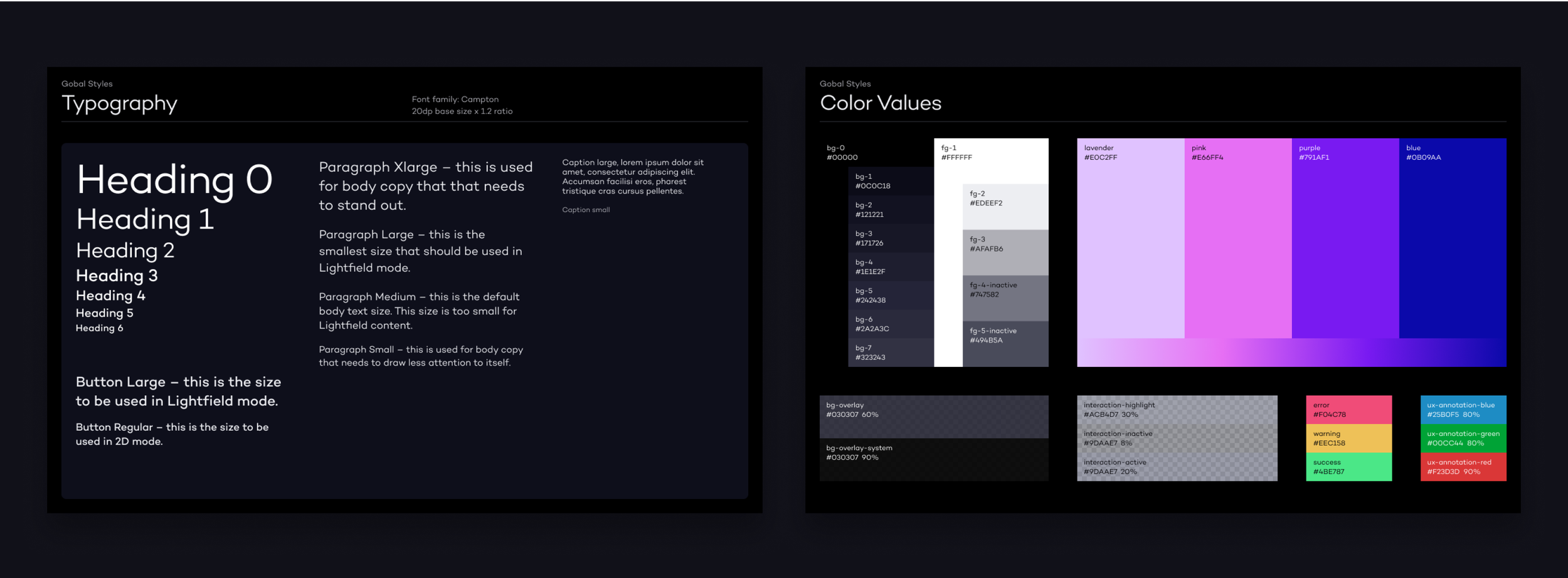
This foundational section contains design elements like color and typography used across Leia products. The aim is to create a cohesive design language representing the brand.
Guided by universal font guidelines and principles, I crafted a type scale to ensure readability and consistency across platforms and devices. Key steps included defining hierarchy in terms of size, weights, spacing, and alignment for each font style.
2. Iconography
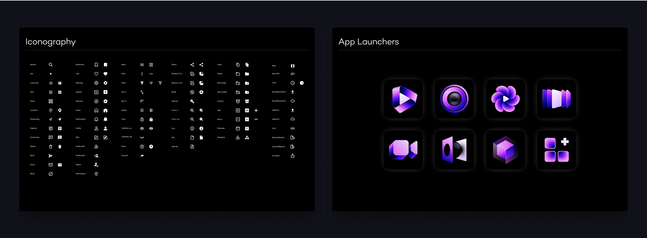
Icons are essential as they help communicate visual meaning quickly and effectively. We opted for simplicity with Google Material Icons. Besides aligning with the framework, Google Material Icons offer a wide variety of options in terms of sizes and styles.
The design system also includes the design of app launcher icons, ensuring they are recognizable and reflective of the Leia brand.
3. Components
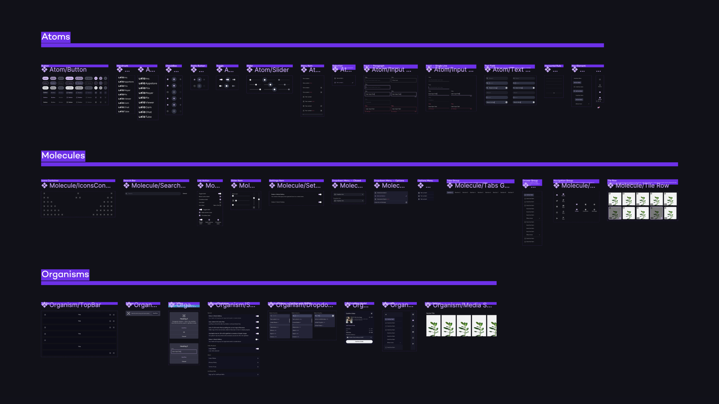
The components library contains reusable UI elements that promote consistency while allowing flexibility for individual app designs.
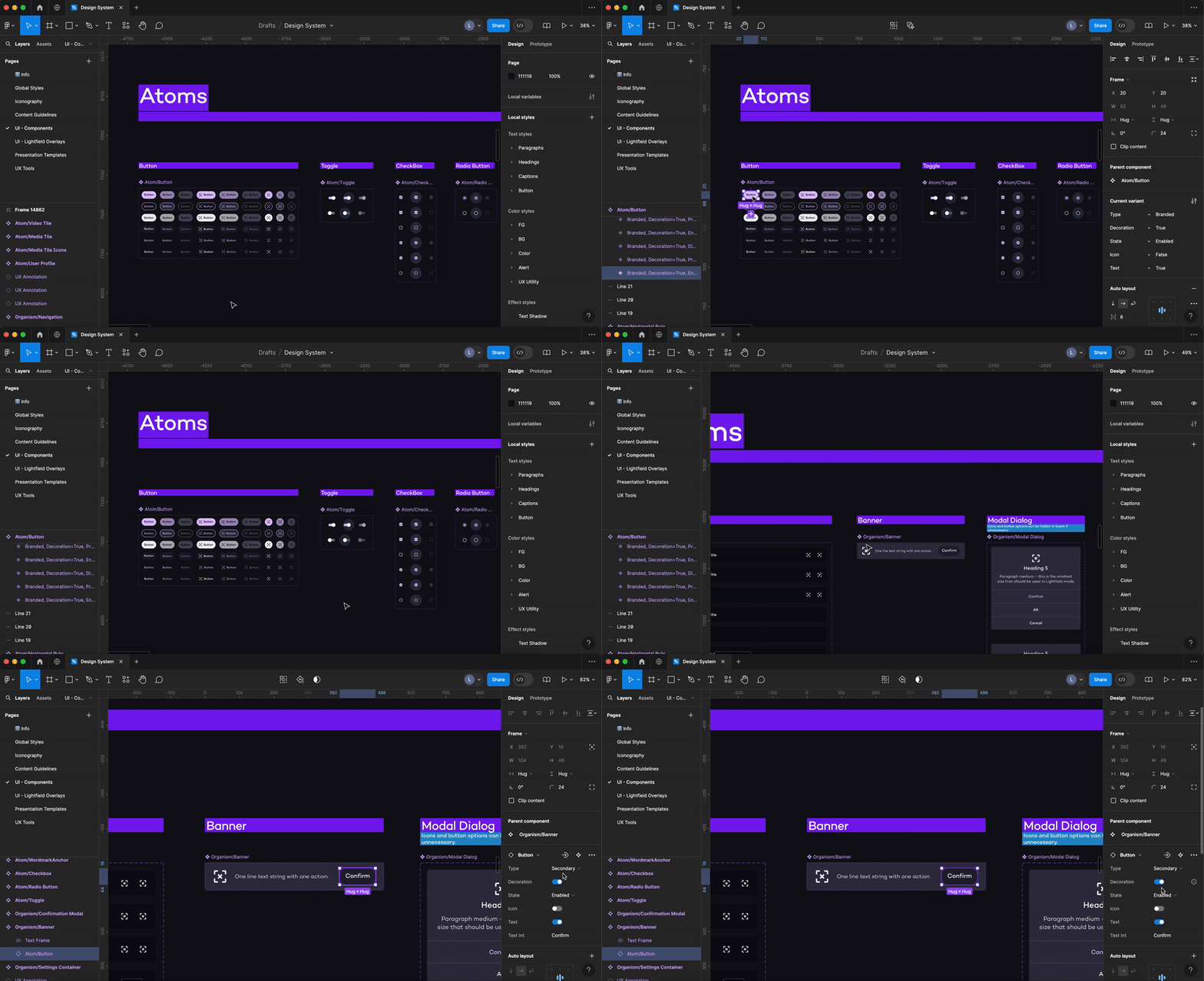
When the Variants feature was introduced to Figma, I started using it to combine variants into component sets with custom properties and values.
Creating Components with
Atomic Structure
Following atomic design principles, I use nested components and component properties to simplify variants, which are key to ensuring scalability.
Take buttons, for example, I created multiple button components and a component set that allows you to change types or states directly in the properties panel. This approach makes components easier to maintain, modify, and swap through.
4. Sample Pages
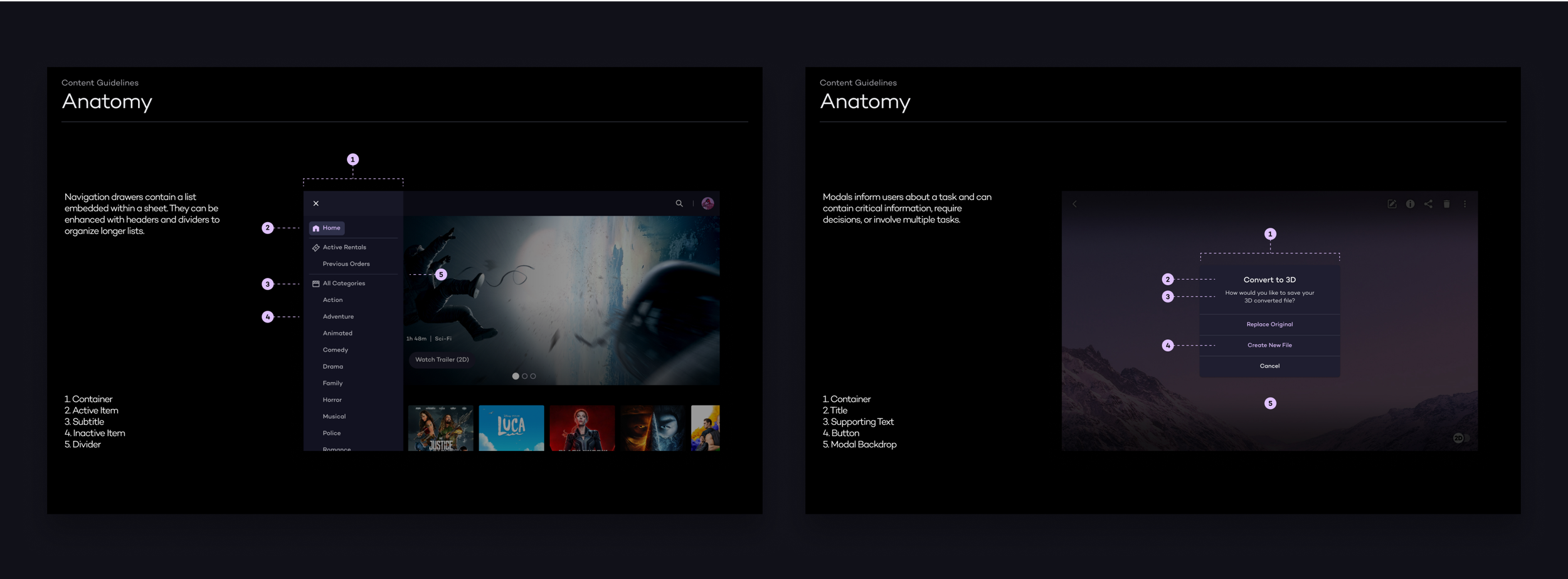
The Design System also includes examples of complete sample pages created using the component library elements. These samples demonstrate how UI components are combined and arranged effectively.
Results
The new design system acts as a centralized resource, which is crucial for maintaining a consistent and intuitive user experience across Lume Pad.
Overall, the team is spending significantly less time on designing and coding new components, making handoff more efficient and reducing back-and-forth during QA. The coded designs are also more consistent.
We are gradually updating all designs to align with the new design system. The process begins with newer features and products, followed by redesigns of existing products, and will eventually include legacy products.